|
Well it looks like panic is starting to set in again - but is really time to panic? Well in my opinion its never time to panic, but it may pay to start being cautious. To be clear, this post is not a recommendation to buy or sell anything, its simply my analysis and opinion. At the time of writing (The evening of 20 September 21 - AEST) the predominate reason for the ASX being spooked today (around 2% drop) seems to be indicated as the either the Evergrande situation or iron ore dropping (perhaps both as I'm sure there is a nexus). Although there is some thought that it could be the movement on the US index futures (although maybe they're being influenced by the same thing...). As for a trend follower and technical analyst such myself the reason is pretty much moot, that being said, it does pay to pay attention to some real-world signals. I have observed that often after a string of red days (or a single big red day), you often start seeing lots of bearish sentiment appear on various financial media and social media pages. It seems that as soon as there is a bit of a drop, the bears come out and start spruiking the bear case. These posts/articles tend to suck people in and start to set up a bit of a negative mindset. So ignoring the big news, let us look at the charts and see what they are showing. Let us start with the ASX 200 (XJO). 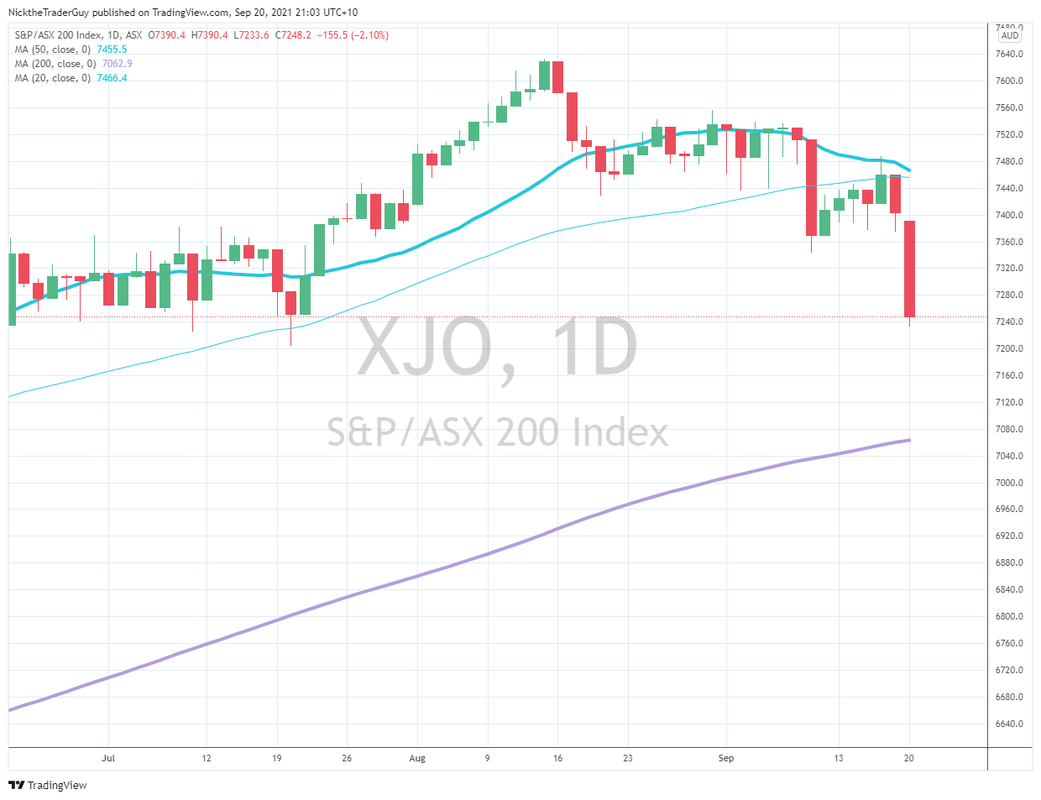 From the above chart, it looks fairly apparent that a downtrend has started forming, starting from the most recent high of 13 August. The chart shows that following the open on 14 August, the market failed to make a new high and started trending downwards for the following week.
Fairly solid resistance was then found at around 7460 on 19 August, with several retests until around 9 September (between these dates, the market seemed to be trading in a fairly tight 60 point range). On 9 September, the support level was broken. For the following week (until 17 September), the previous support level provided resistance, with another support offered around 7360 (the close on 9 September). Today's movements seem to pretty clearly break through that resistance, but we'll need to see what tomorrow brings. Other things that I note on the chart are the 20 and 50 days MAs, the 20 days MA will likely cross the 50 day (a bearish indicator in my view). Overall, the chart doesn't look particularly good for long trades, and I'm certainly reducing my capital at risk. I may start taking a few limited short trades at this point, but I won't flip to a full bearish position unless I see a confirmed break of the 200 day MA (currently around the 7000 mark). I think as I said up front, it would be prudent to be cautious at this point and I'll be refraining from taking full-size positions. Anyway, I hope someone found this useful. Cheers Nick the Trader Guy 20 September 21
0 Comments
 First up, apologies for the long delay since my last post, life got in the way over the last couple of months. I'm still trading and growing my capital, so it's all good!
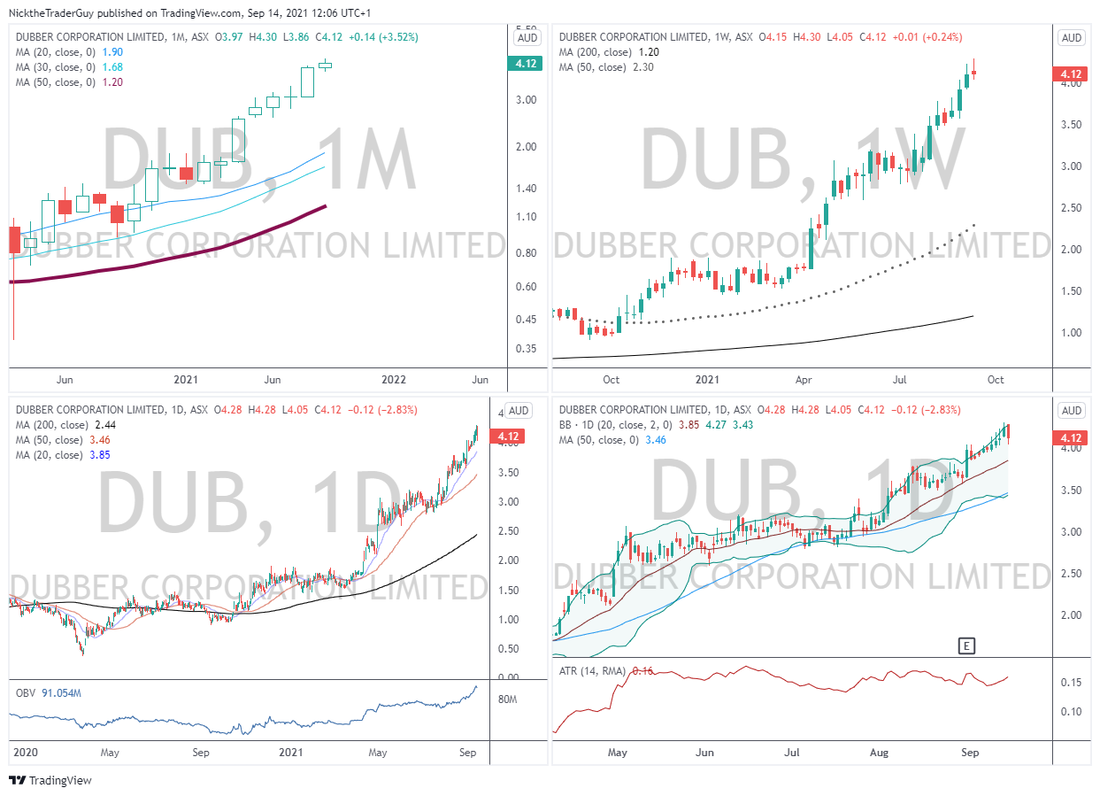
As alluded to on the main page, in this post I am going to talk a little about my process (in broad detail). I've got a few different entry methodologies that I use to identify trades. In this post I'm going to focus on my Breakout methodology. Part 1 - Instrument Selection (Breakout Methodology) . When I first started trading, I'd simply choose a stock based on what was moving that day. There was no forward planning, no though beyond, "shit, that stock's moving today, I'll buy some shares and hope for the best." Needless to say this strategy was profitable in short term but horrible in the longer term These days, I plan all my stock picks in advance. Each weekend (usually Sunday night), I'll do a stock screen generally looking for stocks which have unusual volume and momentum. I then put this stocks on what I call my first cut watch list. I'll also do a similar screen of the futures markets, but I don't worry so much about volume with stocks, its more just momentum and trend. Once I've populated my first cut watch list, I pull up my charts. I use a four pane set up in trading view looking at Monthly, Weekly and then 2 daily charts (one zoomed in and one zoomed out). I look for stocks which have been trending well in the past on the monthly and weekly charts and a clear trend on the daily (steady momentum in the trend direction). If I see this, the stock gets added to my Trade Watch List. From there I monitor the stock following the open on Monday and will generally enter a trade after the first hour of trade has passed. That it, I try and keep in simple with my instrument selection. All in all I spend about an hour a week reading the charts and determining trade set-ups. Here's an example of my chart set-up. You can see I keep my charts simple a few Moving Averages as indicators and a Bollinger Band for an indication of volatility. Happy Trading Cheers Nick the Trader Guy 14 September 21 |
Archives
February 2023
Categories |
 RSS Feed